For those taking CS1300 next semester I suggest them to:
1. Come to class from day 1- it really helps to come to class and learn in order to do the homework as good as possible. If you miss class it's easier to get lost.
2. Do not procrastinate- if you leave everything for the last minute it will harm you since most assignments take longer than you think.
3. DO NOT take this as your 18 hour class- this goes especially for sophomores and juniors that have a lot of upper division or dificult classes, this is a demanding class and you actually learn a lot so take it seriously and understand that the workload is substantial.
Finally just enjoy and learn because this is a class you can get so much from and that will help you in every single field within your career and life.
Tuesday, April 26, 2011
Students Websites
My three favorite websites were Katie's, Morgan's, and Kayleigh's.
Katie's website was nicely designed and very appropriate for her topic. I really liked her navigation bar and her pictures were all very interesting and engaging.
Morgan's website was amazing, it was very creative and the design was outstanding. It looked very professional and each page was well organized and very nicely done.
Kayleigh's website had a unique twist to it which were the transitions for every page and I thought that was really cool and I like she included something new to the table.
Thursday, April 21, 2011
Website
Please visit my website at www.cs.trinity.edu/~apinto1
Finalizing my website was quite challenging but very fulfilling. I had helped to do a professional website before therefore I expected it to be a similar experiece, but I had never used Expression Web so it was a completely new experience. It was very time consuming to make sure all the details were in and although it looks like a simple website, it took a lot of effort, time, and patience. I used hand coding and Expression Web, I tried to use KompoZer since I am a Mac user but it was too complicated. I believe that the section I am most proud of is my gallery and collections page because it took me a long time to align the tables and to make sure that all the thumbnails were the correct size and hoped they all worked. One of the things I plan to could change is to delete the blue borders of my thumbnails because it does not go with the layout or design. My biggest technical challenge was to just learn through working and trying different things how to use tables to align pictures since I started off using just one column tables instead of one with many and this made my website a lot more organized. My biggest decide challenge was to decide how to organize my photos in my all photos page, but I decided to do it by my favorite pictures and to appeal design wise I put all the vertical pictures in the last three rows and the horizontal ones in the first row. I would love to show my website to my family and friends so they can see my development as a photographer and hopefully potential customers. After learning how to make a website I will definitely make one for another class or another ocassion in the future.
Finalizing my website was quite challenging but very fulfilling. I had helped to do a professional website before therefore I expected it to be a similar experiece, but I had never used Expression Web so it was a completely new experience. It was very time consuming to make sure all the details were in and although it looks like a simple website, it took a lot of effort, time, and patience. I used hand coding and Expression Web, I tried to use KompoZer since I am a Mac user but it was too complicated. I believe that the section I am most proud of is my gallery and collections page because it took me a long time to align the tables and to make sure that all the thumbnails were the correct size and hoped they all worked. One of the things I plan to could change is to delete the blue borders of my thumbnails because it does not go with the layout or design. My biggest technical challenge was to just learn through working and trying different things how to use tables to align pictures since I started off using just one column tables instead of one with many and this made my website a lot more organized. My biggest decide challenge was to decide how to organize my photos in my all photos page, but I decided to do it by my favorite pictures and to appeal design wise I put all the vertical pictures in the last three rows and the horizontal ones in the first row. I would love to show my website to my family and friends so they can see my development as a photographer and hopefully potential customers. After learning how to make a website I will definitely make one for another class or another ocassion in the future.
Thursday, April 7, 2011
Power Point Presentations
I enjoyed doing this assignment very much and was very content with my final outcome. I decided to pick a topic that would interest the students in my class and that could bring a beneficial message to all. AKPsi business fraternity was well shown through the four slides compiled of transitions, animations, videos, among other power point techniques. Doing this presentation taught me so much about producing an interesting and successful power point presentation since I put many transitions in one slide without needing to have 20 slides to put in all my information. I found that many animations can pertain exactly to the purpose like highlighting or making a shocking entrance. Learning how to do hyperlinks and using a slide's space wisely was my favorite part and was also the part that I am most proud of and most liked in my presentation. I also liked that the layout and progression of my power point allowed me to fluidly present to the audience and did not distract or diminish the presentation overall. The only thing I would have added or improved was to present the three interesting facts of slide three in a more interactive and engaging way.
The presentations that I most liked were Hank's and Morgan's. I really enjoyed Hank's presentation because it was a very interesting topic for me and he presented in an engaging way. He showed all the power point skills we learned and compiled them in the presentation so that it attracted the audience to the subject. Morgan's topic especially appealed to me since I personally love this organization and she appealed to all the audience's emotion through her shocking visuals and smoothly put them together through the successful use of transitions.
The presentations that I most liked were Hank's and Morgan's. I really enjoyed Hank's presentation because it was a very interesting topic for me and he presented in an engaging way. He showed all the power point skills we learned and compiled them in the presentation so that it attracted the audience to the subject. Morgan's topic especially appealed to me since I personally love this organization and she appealed to all the audience's emotion through her shocking visuals and smoothly put them together through the successful use of transitions.
Tuesday, April 5, 2011
Pictures that lie
The article that I read was quite inspiring and helped me came up with my idea. This article I found from the database Academic Search Complete talked about how in France there was a marketing campaign going on in order to use image alteration to ban all images of tobacco. They replaced tobacco images with kids windmills. They talked about how this influences french cinema and they also became part of the controversy and campaign. Therefore, one can analyze that as much as image alteration can be hazardous in many ways to society, people nowadays are finding positive ways to use this fantastic tool.
Roddick, Nick. "Pipe dreams." Sight & Sound 19.7 (2009): 14. Academic Search Complete. EBSCO. Web. 5 Apr. 2011.
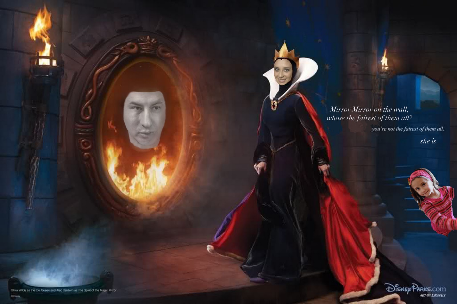
The picture that I chose to do was a quite entertaining one with a subtle message and a personal approach to it. I used many pictures, three of them are layers and they were all taken by me because its a picture of my cousin, my uncle and me. The background picture was part of one of my favorite's photographer's, Annie Lebovitz, Disney series. I used various tools to manipulate, first of all I had three different layers and each layer is altered in many ways. I changed saturation and lightness in two layers and then merged them down so that they only changed the layer in question. I added two text layers to give the picture that personal approach and meaning and I deleted part of the original text by coloring in the color of the background on top. I used the eraser tool a lot, I also used the blur tool, the selection tool and I changed the opacity in every layer. I decided to manipulate this picture because first of all the composition of this caricature background is amazing and it brings back memories from when I was very young. The underlining idea is that people are always looking for approval "beyond the mirror" and this is portrayed in fantasy stories we hear since we are children. I decided to continue with this fairy tale and grant the happiness to a beautiful little girl instead of the evil witch because although many of this made up stories are exaggerated they still have that element that good beats bad above all. Unfortunately, I am the witch in this alteration, but it fits quite right since I am smiling therefore I approve of the beauty of this little girl. This manipulation is not harmful if it is not published because the original background is part of a famous photographer's work, therefore it would be infringement of copyrights, but besides that it is not harmful just entertaining and meaningful in a way. Finally, it relates to the article I read because in both image manipulation cases one is trying to alter the message sent to childhood by altering the original intended message. In this case we are banning tobacco and shallow superficiality and creating childish positive messages of no tobacco in the media and society, and happily ever afters.

Roddick, Nick. "Pipe dreams." Sight & Sound 19.7 (2009): 14. Academic Search Complete. EBSCO. Web. 5 Apr. 2011.
The picture that I chose to do was a quite entertaining one with a subtle message and a personal approach to it. I used many pictures, three of them are layers and they were all taken by me because its a picture of my cousin, my uncle and me. The background picture was part of one of my favorite's photographer's, Annie Lebovitz, Disney series. I used various tools to manipulate, first of all I had three different layers and each layer is altered in many ways. I changed saturation and lightness in two layers and then merged them down so that they only changed the layer in question. I added two text layers to give the picture that personal approach and meaning and I deleted part of the original text by coloring in the color of the background on top. I used the eraser tool a lot, I also used the blur tool, the selection tool and I changed the opacity in every layer. I decided to manipulate this picture because first of all the composition of this caricature background is amazing and it brings back memories from when I was very young. The underlining idea is that people are always looking for approval "beyond the mirror" and this is portrayed in fantasy stories we hear since we are children. I decided to continue with this fairy tale and grant the happiness to a beautiful little girl instead of the evil witch because although many of this made up stories are exaggerated they still have that element that good beats bad above all. Unfortunately, I am the witch in this alteration, but it fits quite right since I am smiling therefore I approve of the beauty of this little girl. This manipulation is not harmful if it is not published because the original background is part of a famous photographer's work, therefore it would be infringement of copyrights, but besides that it is not harmful just entertaining and meaningful in a way. Finally, it relates to the article I read because in both image manipulation cases one is trying to alter the message sent to childhood by altering the original intended message. In this case we are banning tobacco and shallow superficiality and creating childish positive messages of no tobacco in the media and society, and happily ever afters.
Thursday, March 24, 2011
Learning from Chris Nolan
Mr. Nolan’s presentation was very instructive and taught me a lot about useful tools for every day use of search engines. Important common sense information I was unaware of such as the fact that .com signals that it is a commercial site, .org represents non profit organizations, among others. I also found it very useful to learn that Google shows the popular sites in the initial pages, but scholarly journals and information that could be really helpful is in the pages further back. Something that surprised me from this informative lecture was the JC Penney case:
JC Penny contracted a company who created fake websites that linked to the JC Penney webpage so it was on an extremely high place in many search results. Google changed logarithms and took other measures to avoid this to happen and allow more honest search to occur.
This showed Google is valuable and in many ways tries to find the best results for its customers
Wednesday, March 23, 2011
Power Point Entry
Power point is one of Microsoft Office's greatest tools in my opinion. It helps to organize ideas into a single presentation which portrays them in an organized manner which is visually appealing to an audience. Furthermore, it contains so many small applications within to make the presentation interactive and interesting. Hyperlinks and transitions help the presentation be smooth and easy to use in order for the person giving the presentation to not distract others by taking out posters or other ineffective aids. Lately power point is used more and more throughout businesses and educational systems, one can even suggest that in many ways it is over used or incorrectly used.
Although power point is a fantastic tool, people tend to misinterpret the purpose of it and use it erroneously. Coming to college was very different to what I was used to in my school where power point was used by the students to give entertaining presentations to the class. At Trinity most professors use power point and it really is evident how they use it just to write down information instead of using all its tricks and tools to make the class better. One of the things they tend to do is write a lot of information in each bullet point which just makes it visually hard to see and it drags on the presentation longer. Another thing seen on an awful power point presentation is the lack of organization. Each slide layout is there to help each section and many times scattered ideas and data are found all over the presentation without considering that each sub topic can be narrowed down into one or a few organized slides. Using transitions helps and many times we see this application being neglected, when it takes only a few seconds to add them. Honestly as I learn more about power point I realize how easy it is to make a great presentation and how we could all benefit from it. I just hope to take advantage of this amazing tool once I learn more about its wonders!
Although power point is a fantastic tool, people tend to misinterpret the purpose of it and use it erroneously. Coming to college was very different to what I was used to in my school where power point was used by the students to give entertaining presentations to the class. At Trinity most professors use power point and it really is evident how they use it just to write down information instead of using all its tricks and tools to make the class better. One of the things they tend to do is write a lot of information in each bullet point which just makes it visually hard to see and it drags on the presentation longer. Another thing seen on an awful power point presentation is the lack of organization. Each slide layout is there to help each section and many times scattered ideas and data are found all over the presentation without considering that each sub topic can be narrowed down into one or a few organized slides. Using transitions helps and many times we see this application being neglected, when it takes only a few seconds to add them. Honestly as I learn more about power point I realize how easy it is to make a great presentation and how we could all benefit from it. I just hope to take advantage of this amazing tool once I learn more about its wonders!
Subscribe to:
Comments (Atom)